
Table of Contents
ToggleGenshin Impact didn’t just become one of gaming’s biggest live-service titles by accident. Since its 2020 launch, HoYoverse (formerly miHoYo) has built a world that pulls players in through sheer visual ambition. The art direction is everywhere, from the way sunlight hits Mondstadt’s cliffs to the intricate details on a five-star artifact you’ll never see unless you zoom in. This deep dive explores how Genshin Impact’s art philosophy shapes every pixel on screen, examining everything from character design and regional aesthetics to weapon visuals and the cultural influences that make Teyvat feel alive. Whether you’re a casual player admiring the views or a designer studying how an Asian studio cracked the anime-gacha formula globally, there’s something deliberate behind every visual choice here.
Key Takeaways
- Genshin Impact art succeeds by merging anime-inspired character design with open-world scale, using vibrant color palettes optimized for phones, tablets, and PCs simultaneously.
- Regional environments are built on real-world cultural research—from Mondstadt’s European aesthetics to Sumeru’s blended Egyptian, Hindu, and African influences—creating emotionally distinct gameplay experiences.
- Character design evolution over five years shows dramatic improvements in facial detail and clothing complexity, with newer five-star characters displaying more sophisticated lighting, reflections, and material realism than launch-era designs.
- Genshin Impact art communicates gameplay information visually: color psychology ties elements to characters, rarity tiers map to visual quality, and glowing interactive objects guide players without constant UI handholding.
- The game’s minimalist UI design keeps environmental storytelling front-and-center, allowing art direction to carry narrative weight and encourage player exploration through visual cues rather than quest markers.
- A thriving global fan art community continuously reinterprets Genshin Impact’s distinctive character designs through cosplay, fan illustrations, and creative remixes, creating a cultural feedback loop that strengthens the game’s visual identity.
The Visual Philosophy Behind Genshin Impact’s Art Style
Genshin Impact’s art direction is built on a deceptively simple principle: anime aesthetics meet open-world scale. HoYoverse took the hand-drawn charm of character design, something that resonates hard with Japanese anime fans, and fused it with real-time 3D rendering across massive, traversable environments. This hybrid approach gives the game a unique identity that stands apart from both pure anime games (which are usually more linear) and Western AAA open-worlds (which favor photorealism).
The color palette is intentionally vibrant. Teyvat isn’t trying to be gritty or realistic. Instead, you get saturated skies, glowing elemental effects, and character designs that pop off the screen. This choice has practical implications: in a game where you’re exploring for hours, visual appeal matters more than hyper-realism. The team at HoYoverse understood early that Genshin Impact art would be viewed on phones, tablets, and PC screens simultaneously. Saturated colors, clear silhouettes, and distinctive designs work across all these platforms without losing character.
Anime-Inspired Character Design
Character design in Genshin Impact draws heavily from anime traditions: expressive eyes, exaggerated proportions, and distinct visual themes tied to personality and element. A character’s color scheme isn’t random. Lumine, the female protagonist, wears white and gold to suggest purity and starlight. Fischl, the purple-themed Investigator, has a design that screams mischief and mystery through her color choices and costume details.
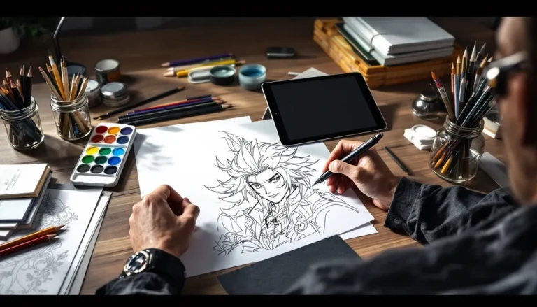
Each character gets a Genshin Impact official art treatment in promotional materials, and these illustrations inform how their in-game models are built. The official art captures a more stylized, illustrative version of the character, while the 3D model translates that essence into real-time rendering. This consistency between promotional art and in-game appearance is crucial, players recognize characters instantly, whether they’re looking at a splash screen or running around the overworld.
Open-World Environment Aesthetics
What sets Genshin Impact apart from other anime-style games is that it commits to massive, explorable landscapes. The environment art isn’t just backdrop: it’s gameplay. Players traverse these spaces for tens or hundreds of hours, so the art team invested heavily in visual variety and environmental storytelling.
Mondstadt feels like a European countryside, rolling green hills, stone architecture, clear blue skies. Liyue shifts to inspired-by-China aesthetics: red lanterns, golden roofs, misty mountains. These regional distinctions go beyond texture work: they shape how players experience navigation and discovery. The art direction telegraphs where you are without reading a UI element. This is intentional, sophisticated level design disguised as beautiful scenery.
Character Art And Design Evolution
Genshin Impact launched in September 2020, and the character art has evolved noticeably over five years of continuous updates. Early characters like Amber and Barbara have clean, charming designs that still hold up, but comparing them side-by-side with recent Fontaine characters reveals how much the art team’s 3D modeling capabilities have improved.
How Character Models Have Improved Over Time
The jump is most visible in facial detail and clothing complexity. Early game characters had simpler face topology, fewer polygons, less nuance in eye expression. Characters released from 2024 onward show dramatically improved eye rendering, with more sophisticated lighting and reflection. Clothing materials also evolved: fabrics now show realistic folds, stitching details are more visible, and metallic elements reflect light convincingly.
HoYoverse didn’t retroactively update every old character’s model, which created a subtle visual hierarchy. Newer five-star characters look noticeably more polished than launch-era designs. This is standard in long-running games, but it’s worth noting for players who care about visual consistency. The team balanced this by ensuring that character animations remained fluid and expressive across all ages of design.
One technical achievement often overlooked: character customization during the Traveler’s element changes. The Traveler’s appearance shifts based on their active element (Pyro, Hydro, Electro, etc.), and each version maintains design integrity while feeling distinct. This kind of systemic art scalability is hard to pull off and shows thoughtful character pipeline design.
Signature Character Archetypes And Their Visual Distinctions
Genshin Impact operates with recognizable archetypes, but each character visual gets a signature twist. Consider the Cryo elemental archetype: Shenhe, Eula, and Ganyu all use blues and whites, but their designs tell completely different stories. Genshin Impact Eula: Unleash covers how Eula’s design emphasizes nobility and physical presence through her dancer-like costume and choreography. Shenhe channels ascetic spiritual warrior energy through minimal, flowing robes. Ganyu blends human and adeptus qualities through her half-human, half-qilin design language.
This visual differentiation matters for gameplay clarity, too. At a glance, players recognize what role a character fills. DPS characters tend to get more dynamic, aggressive silhouettes. Healers and supports often wear more enclosed, protective-looking costumes. Shielders and tanks get heavier, more imposing designs. This isn’t universal, HoYoverse breaks these rules regularly, but the baseline helps players intuitively understand a new character’s role without reading tooltips.
Color psychology plays a role here. Pyro characters trend toward warm reds and oranges. Hydro characters favor blues and teals. Electro goes purple. When you pull a new five-star from the gacha, the visual identity communicates its element instantly. This is basic design literacy, but it’s executed cleanly across hundreds of character designs.
Regional Art Styles And Cultural Influences
One of Genshin Impact’s greatest strengths is how regionally distinct each area feels. HoYoverse didn’t just reskin the same assets across different zones. Instead, they committed to researching real-world architectural and cultural traditions, then translated them into game art.
Mondstadt’s European-Inspired Aesthetics
Mondstadt draws from medieval and Renaissance European architecture. Stone buildings with pitched roofs, castle fortifications, gothic arches, the geometry is distinctly Western. The color palette leans toward cool grays and warm creams, with deep green vegetation providing contrast. The open fields, vineyards, and pastoral settlements reference Germanic and Alpine regions specifically.
Characters from Mondstadt reflect this: they wear European-inspired clothing styles, speak with a slightly formal (if whimsical) cadence, and the region’s cultural identity emphasizes freedom and independence. The Knights of Favonius aesthetic borrows from chivalric traditions. Even minor NPCs in Mondstadt have costume design that feels thematically consistent.
Liyue’s Asian-Influenced Architecture And Design
Liyue is where HoYoverse’s research into Asian architecture becomes immediately obvious. Red and gold color schemes dominate. Curved tile roofs, ornamental gates, lantern lighting, and water features create an aesthetic directly inspired by traditional Chinese design. The Jade Chamber (Ningguang’s residence) is practically a digital museum of Chinese palace architecture.
Characters like Ningguang, Xingqiu, and Hu Tao wear costumes based on historical Chinese clothing styles. Their names use Chinese romanization. The region’s values, honor, tradition, commerce, are reflected in dialogue and quest design. This cultural specificity could’ve felt stereotypical in less careful hands, but HoYoverse treated it as source material to respect and interpret rather than caricature.
When you traverse Liyue, the visual language reinforces the narrative. The Chasm’s dark, mineral-rich aesthetic contrasts with Harbor’s busy merchant energy. Dragonspine’s snow-covered peaks use different lighting and particle effects entirely. This level of environmental art granularity shows each sub-region received dedicated art direction, not just a paint job.
Inazuma, Sumeru, And Beyond: Expanding Visual Diversity
Inazuma, the third major region released in version 2.0 (August 2021), drew inspiration from Edo-period Japan. Torii gates, wooden architecture, red bridges, the visual language shifted dramatically from Liyue’s Chinese influences. The electro-themed region made clever use of purple and blue accents. Raiden Shogun’s castle literally has architectural elements that reference Japanese feudal aesthetics.
Sumeru, released across versions 3.0-3.2 (2022-2023), was HoYoverse’s most ambitious regional design to date. It weaves together influences from multiple cultures, Egyptian, Hindu, African, and Mesoamerican traditions blend into a unique interpretation of a rainforest-desert hybrid region. The Akademiya’s architecture borrows from Islamic and Mediterranean traditions. Character designs in Sumeru show more skin, different fabric patterns, and jewelry that reflects the region’s diverse inspirations.
Fontaine, the fourth major region (versions 4.0-4.2, 2023-2024), channels Art Deco and Belle Époque aesthetics. Golden ornamental details, geometric patterns, elegant mansion architecture. It’s visually distinct while still feeling like part of Teyvat’s consistent universe.
This regional diversity isn’t cosmetic. It shapes how players emotionally experience each area. Mondstadt feels breezy and accessible. Liyue feels sophisticated and ancient. Inazuma feels structured and ceremonial. Sumeru feels exotic and adventure-focused. The best Genshin Impact characters guides often note how regional identities influence character strengths and storytelling, and that foundation starts with art direction.
Weapon And Artifact Art Design
Weapons in Genshin Impact aren’t just mechanical stats, they’re visual statement pieces. A five-star sword looks radically different from a three-star sword, and that visual hierarchy communicates rarity at a glance.
Visual Storytelling Through Equipment Aesthetics
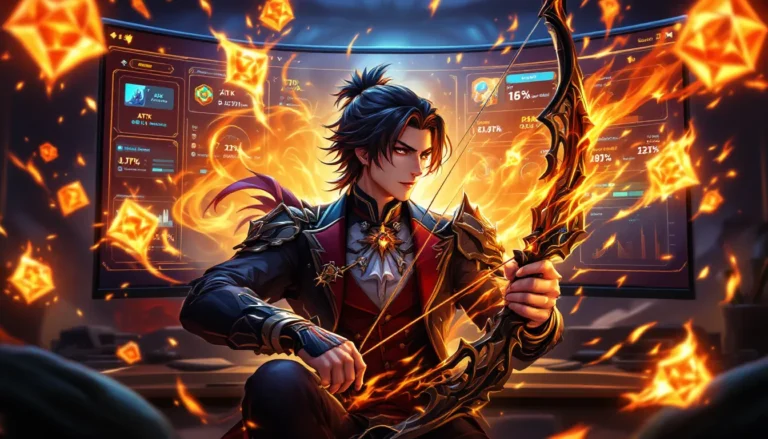
Each weapon tells a story through its design. Mistsplitter Reforged (a five-star sword) glows with ethereal blue energy and features flowing, elegant geometry. Primordial Jade Cutter channels jade aesthetics with green inlays and Chinese-inspired ornamentation. Wolf’s Gravestone (a five-star claymore) is massive and imposing, with wolf motifs carved into the blade.
These designs aren’t arbitrary. They often tie into the character’s backstory or the region where they’re obtained. Weapons from Inazuma feature that region’s design language. Liyue weapons incorporate jade and gold. This systemic approach means players can visually categorize weapons by origin without checking tooltips.
The particle effects that trigger when you hit enemies with weapons add another layer. A Cryo sword creates ice shard effects. A Pyro claymore generates flame bursts. These visual feedback loops make combat feel responsive and rewarding.
Rarity Tiers And Their Distinctive Art Treatments
Rarity in Genshin Impact maps to visual quality almost perfectly. Three-star weapons are functional but plain, simple metals, minimal ornamentation, dull glows. Four-star weapons show more polish: finer details, brighter materials, more elaborate designs. Five-star weapons are works of visual art: they feature complex geometry, multiple materials (metal, gems, ethereal effects), and dramatic silhouettes.
Artifacts, the gear that provides stat bonuses, follow similar logic. Their art isn’t just decorative, artifact sets have visual themes. The Crimson Witch of Flames set features fiery red ceramics and burning motifs. The Blizzard Strayer set uses icy blue tones and snowflake patterns. Equipping a full artifact set on a character creates visual cohesion because the pieces share a design language.
Rarity color-coding (white for common, blue for rare, purple for epic, gold for legendary) helps players instantly identify gear quality. This is standard gacha game design, but Genshin Impact pairs that system with distinctive visual treatment so color-blind players and sighted players alike can parse information at a glance. According to recent coverage on RPG Site, attention to visual accessibility in games has become increasingly important, and Genshin Impact’s approach to equipment design reflects that awareness.
UI And Interface Design
The UI in Genshin Impact is deliberately restrained for an action RPG. Many open-world games clutter the screen with quest markers, minimap corners, and permanent HUD elements. Genshin Impact strips back the default UI significantly, which keeps the art direction front-and-center.
Minimalist Dashboard And Navigation Principles
With the UI disabled, Genshin Impact’s environments shine unobstructed. Even with the UI enabled, HoYoverse uses opacity and positioning to keep the screen clean. The minimap is small and tucked in a corner. Quest text appears unobtrusively. The main menu dashboard uses a card-based layout that feels organized without being cluttered.
This restraint stems from a design philosophy: the world itself should guide the player. Environmental storytelling, a crumbling statue pointing toward a puzzle, a NPC standing visibly in a location, replaces constant UI handholding. This approach requires art direction to carry narrative weight. A well-designed environment teaches players where to go without a giant arrow on screen.
How Art Direction Enhances User Experience
Color psychology shapes navigation intuitively. Interactive objects, chest, doors, puzzles, often have subtle visual highlights. Elemental puzzle mechanisms glow faintly with their element’s color. A Pyro puzzle glows orange. Electro puzzles glow purple. Players learn through visual experience that glowing objects are interactive.
Menu design borrows from the regional aesthetics. In Liyue, menus incorporate gold trim and traditional Chinese patterns. In Inazuma, interfaces feel more structured and geometric. These subtle touches keep players immersed: the UI doesn’t break the fantasy world’s aesthetic.
The character wish (gacha) interface deserves specific mention. HoYoverse makes pulling new characters a visual spectacle, a constellation animation, a character cutscene, a splash of light and sound. It’s designed to feel rewarding regardless of what you actually pulled. This is manipulative game design, certainly, but it’s also a testament to how much care went into making every interaction feel premium. Recent IGN coverage of gacha systems in games highlights how Genshin Impact’s presentation sets industry standards for this kind of interface polish.
Fan Art, Community Creativity, And Cultural Impact
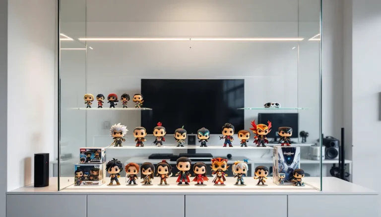
Genshin Impact’s visual design has spawned one of gaming’s most active art communities. Millions of fan artists worldwide create derivative work inspired by the game’s characters and aesthetics, and this organic creativity feeds back into the game’s cultural relevance.
The Global Art Community Surrounding Genshin Impact
On platforms like Twitter, Instagram, Reddit, and specialized art sites, Genshin Impact fan art generates staggering engagement. Character designs are reinterpreted constantly, different outfits, alternate universe versions, crossovers with other franchises. The global playerbase’s diverse backgrounds mean regional characters get art that celebrates multiple cultural interpretations.
Cosplay communities have embraced Genshin Impact heavily. Character costumes are complex, multiple layering pieces, intricate armor details, weapon props. The distinctiveness of character designs makes them recognizable at conventions. This real-world manifestation of in-game art is a feedback loop: cosplayers create visibility, which drives more players to the game, which fuels more art creation.
HoYoverse encourages this through official channels. They host fan art contests, feature community creations on official social media, and occasionally incorporate fan ideas into official merch. This community-first approach strengthens emotional investment in the game’s visual identity.
How Official Art Inspires Fan Creations
Official Genshin Impact official art released during character announcements sets a creative benchmark. Each new character gets a stunning splash screen illustration that showcases that character’s design. These promotional pieces are high-resolution, expertly composed, and serve as reference material for the fan community.
Fans don’t just copy official art, they remix it. Character X with character Y’s clothing style. A character in a different region’s architecture. Fan artists use official designs as jumping-off points for creative exploration. The combination of HoYoverse’s strong art direction and the fan community’s willingness to build on it creates a culture where visual creativity is celebrated.
The official art also humanizes the design process. Behind-the-scenes posts about character design iterations, concept sketches, and design philosophy discussions pull back the curtain. When fans understand that a character’s color palette was chosen deliberately or that a costume design drew from specific cultural references, they engage with the art more thoughtfully. Genshin Impact Sigewinne: Uncover showcases this dynamic, new character designs generate immediate fan discussion about visual themes and storytelling.
The Future Of Genshin Impact’s Artistic Direction
As of March 2026, Genshin Impact’s art direction shows no signs of stagnation. HoYoverse has outlined roadmaps for unreleased regions and hinted at technical upgrades to existing assets.
Upcoming Visual Upgrades And New Regions
Two major regions remain unannounced but heavily speculated: Khaenri’ah and a region inspired by Mesoamerican cultures. Based on the pattern of prior regional design, these areas will likely introduce entirely new visual vocabularies. Khaenri’ah, being an ancient fallen civilization from lore, will probably feature darker, more ominous architecture contrasting with Teyvat’s generally vibrant aesthetics.
HoYoverse has also invested in technology upgrades. Character model updates, improved particle effects, and refined lighting systems roll out periodically. Version 5.0 (expected mid-2026 based on development cycles) is rumored to include enhanced water rendering and improved dynamic lighting, which would significantly impact environmental art quality.
The team has expressed interest in higher-fidelity character models without sacrificing performance across mobile platforms. This balance, pushing visual fidelity while maintaining broad accessibility, will define Genshin Impact’s art direction for the next few years.
One emerging consideration: as the game ages and the player base becomes increasingly diverse globally, HoYoverse faces subtle pressure to represent cultures beyond China, Japan, Europe, and the Middle East more directly. The visual design roadmap likely addresses this through future regions and character designs. Genshin Impact Shenhe: Unveiling demonstrates how newer character designs push stylistic boundaries while maintaining thematic coherence, a blueprint for how future art direction might evolve.
The competitive pressure from other live-service gacha games also matters. Honkai: Star Rail, HoYoverse’s own competitor, has gained traction with slightly different aesthetic choices. The main Genshin Impact team will need to innovate visually to maintain its market position. Expect bolder color palettes, more experimental region designs, and potentially crossover cosmetics that import visual styles from other universes.
Conclusion
Genshin Impact’s art direction is unified by a simple but powerful principle: visual distinctiveness at every scale. From the macro level of regional aesthetics down to the micro detail of artifact ornamentation, HoYoverse treats art as essential to gameplay and narrative, not as decoration.
The game succeeds because its visual design makes smart choices consistently. Anime-inspired character design paired with open-world scale. Regional diversity grounded in real-world research. Rarity systems that communicate through color and detail. UI restraint that lets environments shine. A community that builds creatively on these foundations.
What makes Genshin Impact’s art culturally significant isn’t that it’s the most technically impressive game ever made, it isn’t. It’s that the visual design philosophy is coherent, intentional, and accessible. Players across platforms, language backgrounds, and technical skill levels can appreciate the game’s aesthetics. That accessibility is itself a design achievement.
As HoYoverse continues evolving Genshin Impact’s visual direction through 2026 and beyond, the fundamentals established in the game’s first year will likely remain: strong character design, regionally distinct environments, visual feedback systems that reward exploration, and an openness to cultural influence. Those principles have sustained the game through five years of competition and evolution. They’ll probably sustain it for several more years to come.
For artists, designers, and gamers interested in how modern live-service games approach visual excellence, Genshin Impact remains a masterclass. It’s worth studying not as an artwork to admire, but as a system of thoughtful choices that demonstrate why art direction matters.